设计
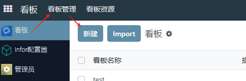
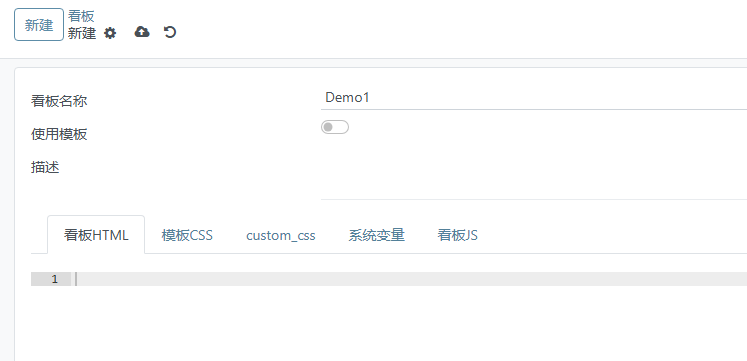
创建看板
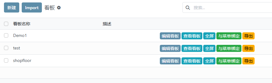
点击新建看板,填写名称
编辑看板
回到看板列表,点击编辑看板进入编辑模式。
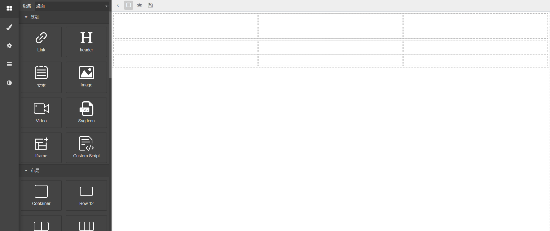
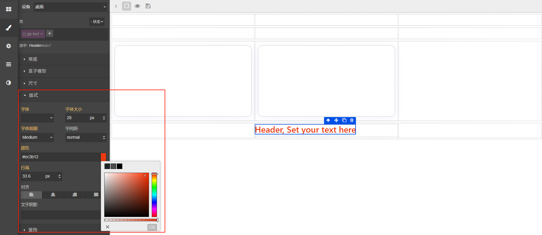
看板编辑页面分左侧工具栏和右侧内容区域,左侧内容为:
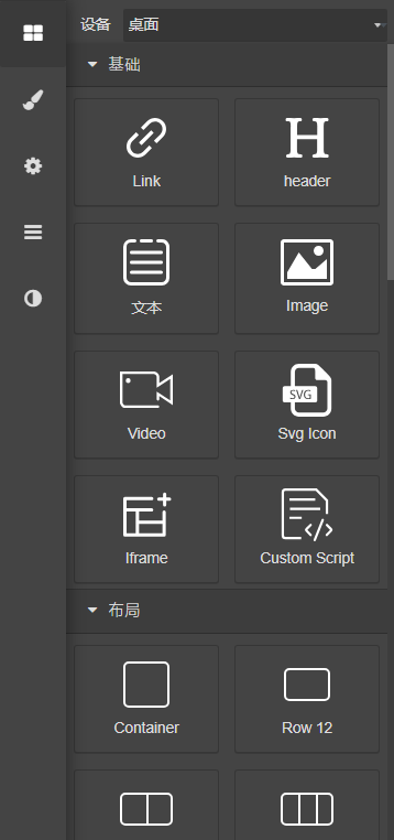
1.区块
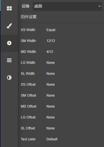
2.样式,定义区块的样式
3.区块设置
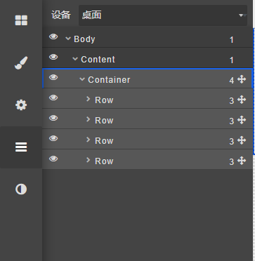
4.分层,按层级查看图表元素
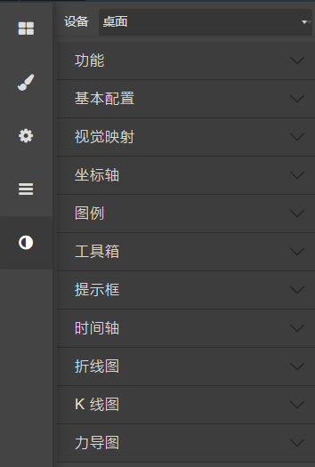
5.图表样式,选择图表整体风格。
编辑布局
编辑布局一般使用布局区块进行布局
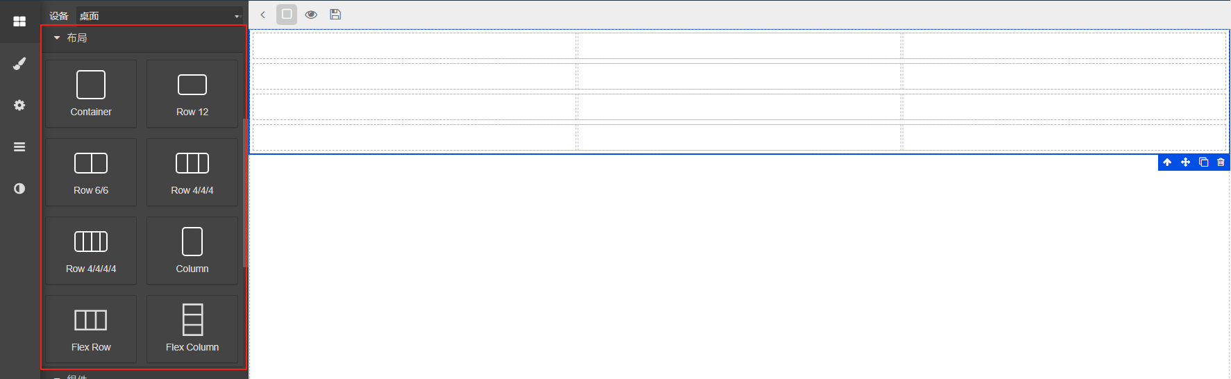
布局使用bootstrap的网格布局,如果需要水平放置元素使用flex row组件,纵向使用flex column组件。
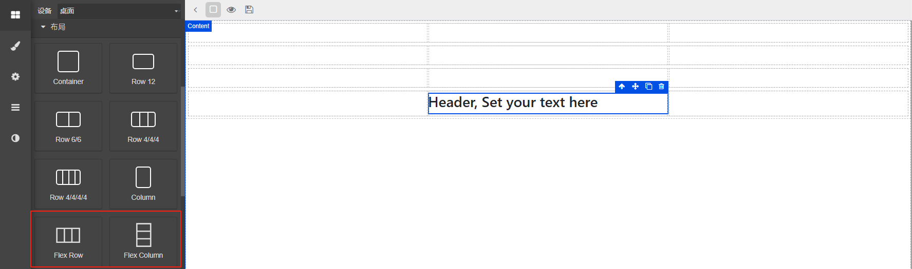
可以通过嵌套Column Row实现复杂的布局效果
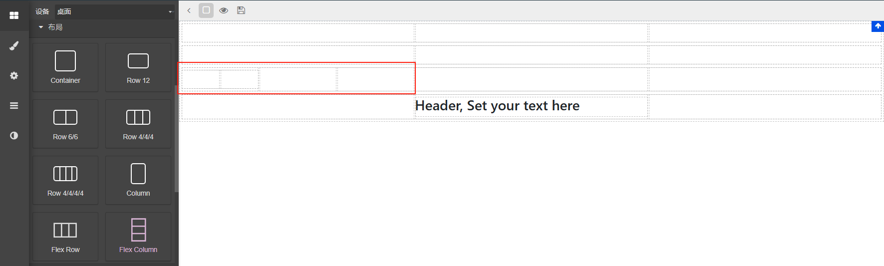
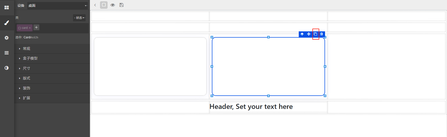
为了更好的体现区块效果,会选择拖动卡片到布局中
单个调整好以后通过复制按扭复制到其它网格,这样可以保持样式统一
更改样式
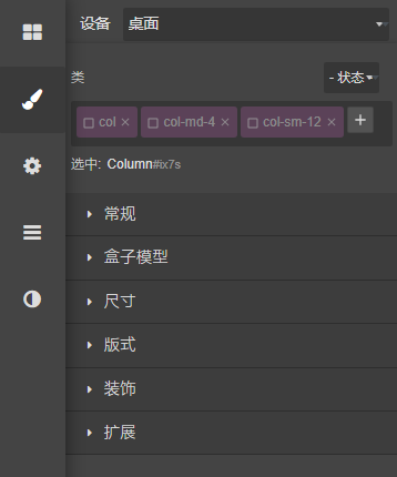
选中元素,在左侧样式面板可以调整字体,颜色,背景,大小,透明度等样式
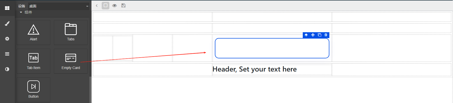
编辑工具栏
选中元素后,元素右上方会出现编辑按钮
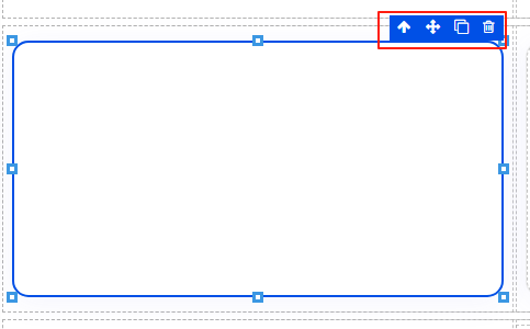
![]() 向上箭头,选中上级元素,
向上箭头,选中上级元素, 十字箭头移动元素,
 复制按扭,复制区块,
 删除按扭删除区块。
一些元素有自己特定的编辑按扭,如图表会有配置按扭。
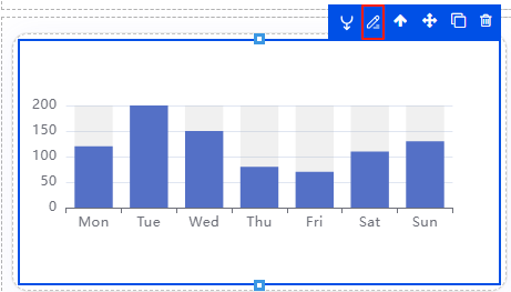
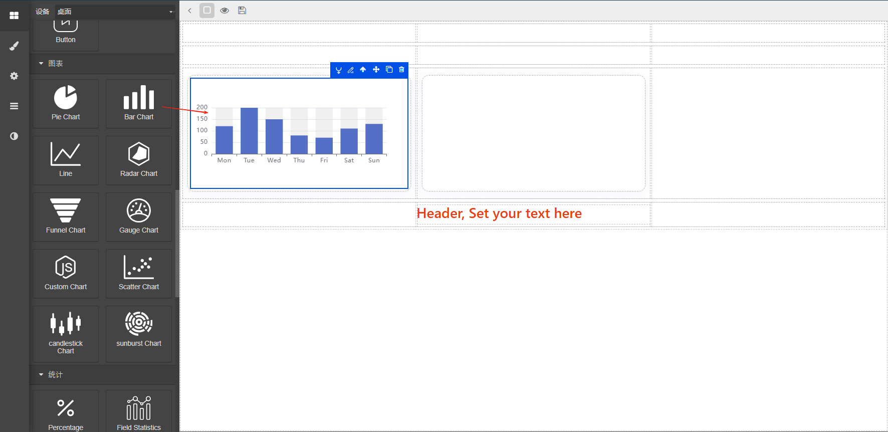
添加图表
图表是看板中必不可少的元素,选中一个图表直接拖动到内容页即可。
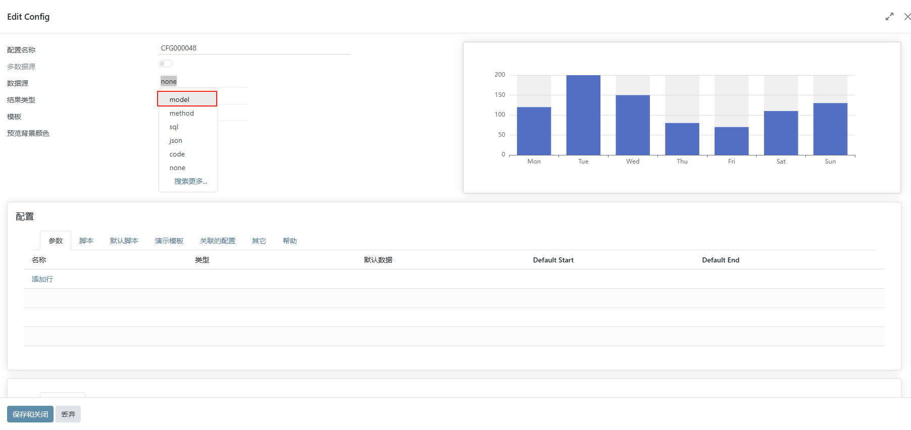
点击编辑按钮进入编辑页面,选择数据源,目前支持以下几种模式,
(1) model模型:选择一个模型,同时在下方分组上选择分组的字段,注意,一些字段,如计算字段等无法进行分组。
通常数据来源选择model(模型)
(2) method模型方法:可以直接调用模型中的方法,返回josn格式的字符串数组
[{
    "code": "908",
    "qty": 43,
    "name": Gear 908,
    "Cost": 93.7,
}]
(3) json: 此种方式一般用于测试,数据格式如第二条。
(4) python代码: 此方式可以直接写代码,调用整理后端数据,结果一定要通过result返回,
可通过self.env['xxxx'].method()的形式获取数据,最终通过result返回数据。
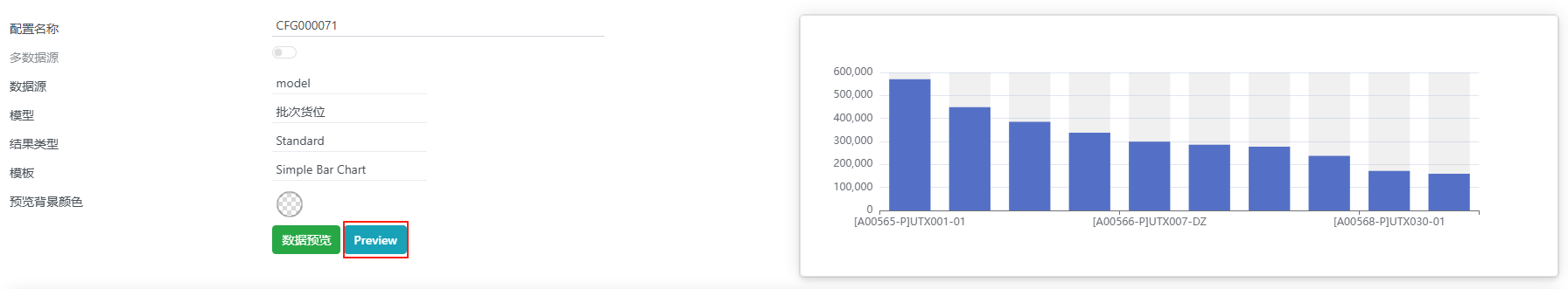
以模型+柱状图表为例,介绍下如何配置图表。选择模型来源,再添加需要展示的字段数据.
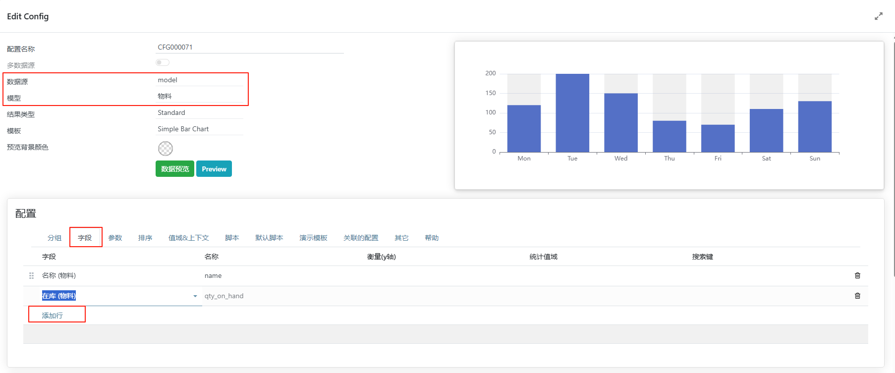
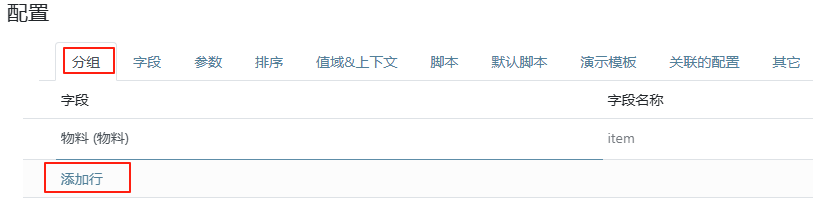
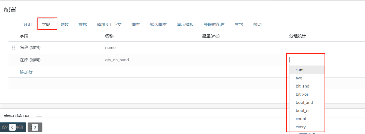
如果需要分组统计,可以点击分组页签选择分组字段.在回到字段页选择需要统计的字段的方法。
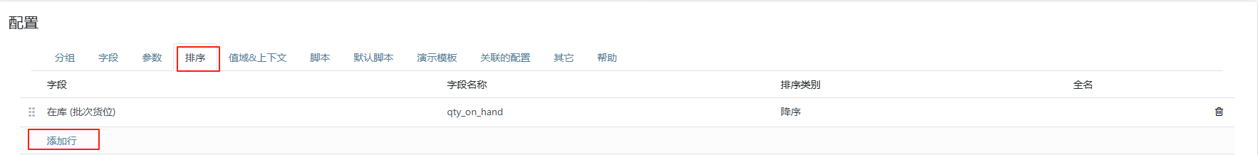
在排序页中可以设置需要排序的字段。
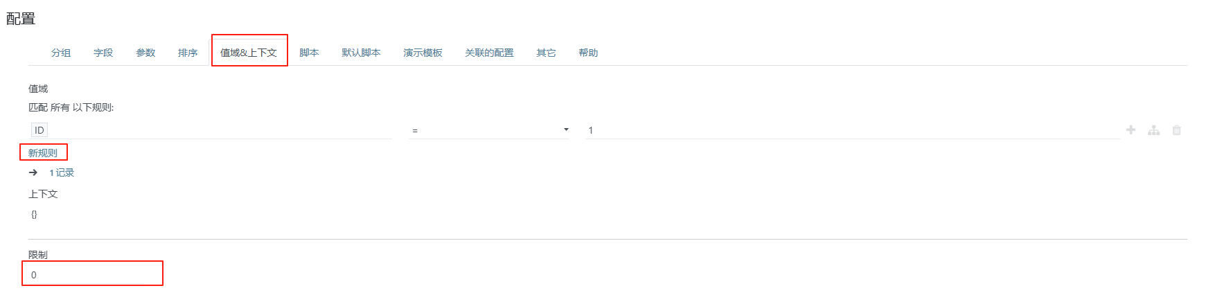
在值域&上下文页中可以设置需要过滤和记录数限制。
配置好后可以点击预览看看效果,确认没问题就可以保存并关闭
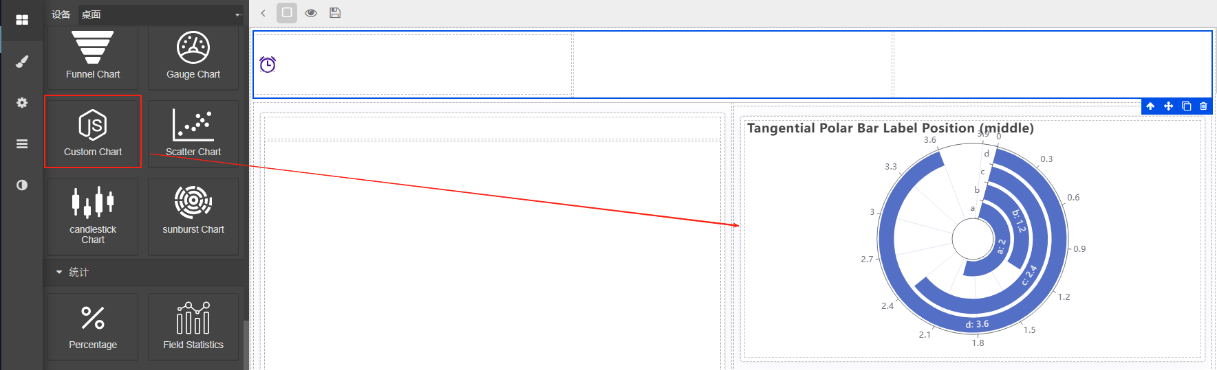
自定义图表
如果内置的图表还是无法满足需求,可以通过自定义图表来实现。点击编辑按扭进入配置界面,此种方式一般使用code作为后端数据源
参考代码如下:
    result = [
    {
        "product": "Matcha Latte",
        "2015": 43.3,
        "2016": 85.8,
        "2017": 93.7,
    },
    {
        "product": "Milk Tea",
        "2015": 83.1,
        "2016": 73.4,
        "2017": 55.1,
    },
    {
        "product": "Cheese Cocoa",
        "2015": 86.4,
        "2016": 65.2,
        "2017": 82.5,
    },
    {
        "product": "Walnut Brownie",
        "2015": 72.4,
        "2016": 53.9,
        "2017": 39.1,
    },
]
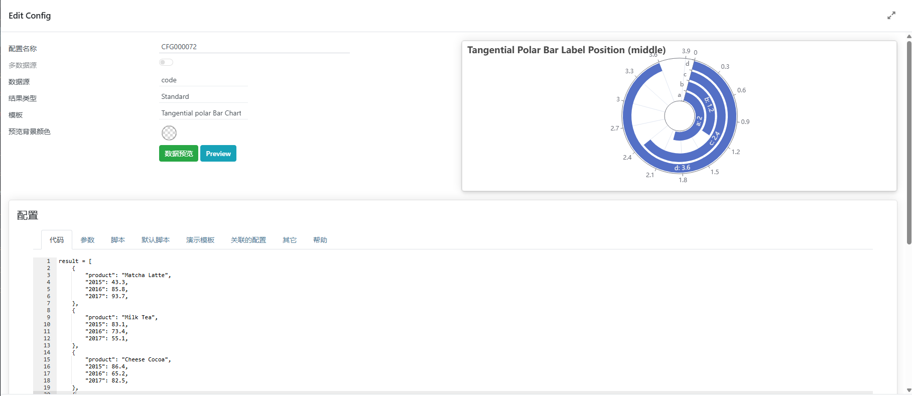
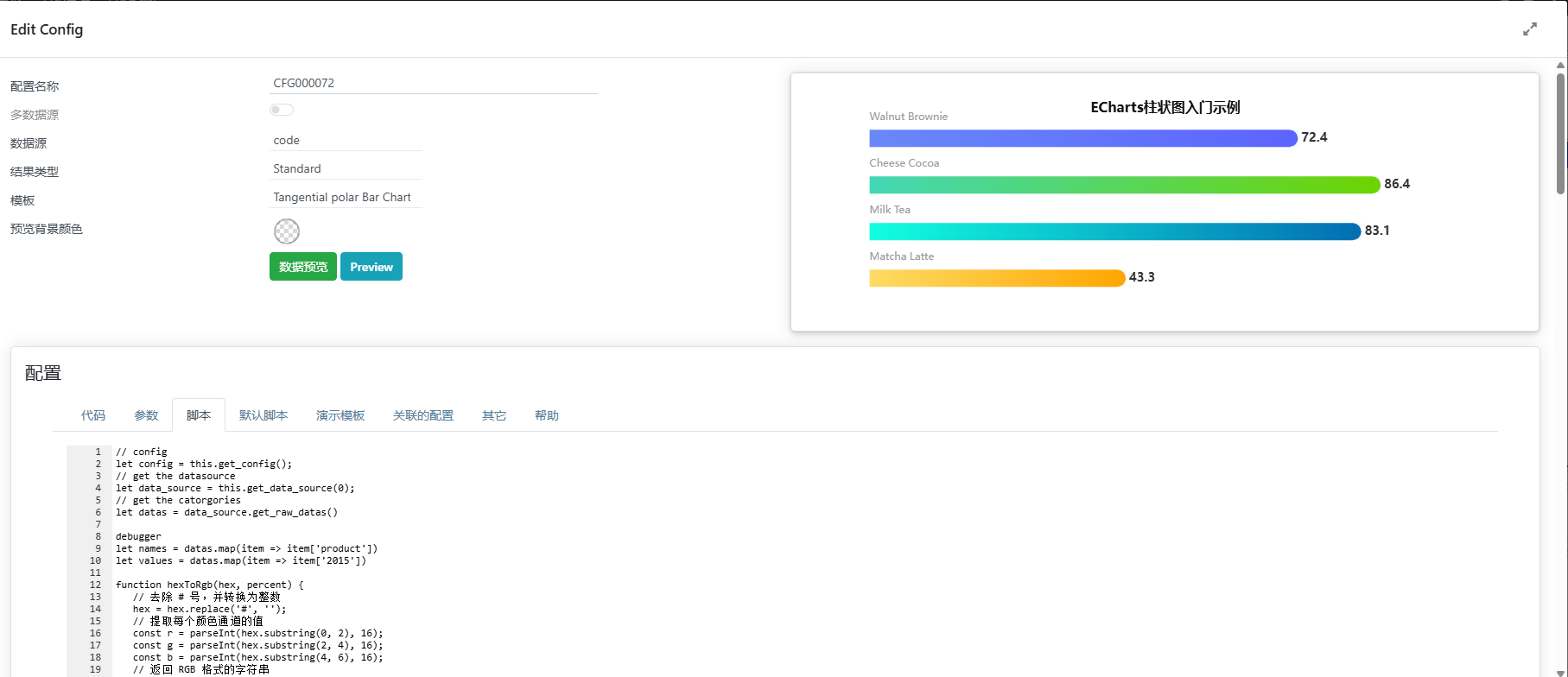
有了后端数据以后就可以对接前端, 这里我们从https://www.isqqw.com/找到一个适合的图表,然后将数据对接上
function hexToRgb(hex, percent) {
// 去除 # 号,并转换为整数
hex = hex.replace('#', '');
// 提取每个颜色通道的值
const r = parseInt(hex.substring(0, 2), 16);
const g = parseInt(hex.substring(2, 4), 16);
const b = parseInt(hex.substring(4, 6), 16);
// 返回 RGB 格式的字符串
return `RGB(${r}, ${g}, ${b},${percent})`;
}
const xData = ['询价','竞争性磋商', '单一来源', '竞争性谈判','邀请招标','公开招标' ]
const yData = [234, 188, 315, 234, 188, 315]
const colorList = [
   '#FFA600',
   '#FEDB65',
   '#026DB2',
   '#12FEE0',
   '#6DD400',
   '#44D7B6',
   '#5C64FF',
   '#6988F8',
   '#0E5FFF',
   '#2DE1FD',
   '#8221F1',
   '#B26DF6',
]
option = {
    title: {
        text: 'ECharts柱状图入门示例',
        left: "center",
        top: "8%",
        textStyle: {
            color: '#111111', // 标题颜色
            fontWeight: 'bold',
            fontSize: 16,
  },
},
tooltip: {
  trigger: 'axis',
  borderWidth: 0,
  backgroundColor: 'rgba(0,0,0,0.75)',
  color: '#fff',
  textStyle: {
     color: '#fff'
  },
  //避免出现多个信息
  formatter: function (params) {
        return params[0].name + `</br><span style="display:inline-block;width:10px;height:10px;border-radius:5px;background-color:${params[0].color.colorStops[0].color}"></span> ` + params[0].value; // 只显示第一个系列的信息
    }
},
toolbox: {
  show: true
},
grid: {
  top: "15%",
  bottom: "10%", //也可设置left和right设置距离来控制图表的大小
},
yAxis: [
{
    data: xData,
    axisLabel: {
    show: false,
    },
    splitLine: {
    show: false,
    },
    axisTick: {
    show: false,
    },
    axisLine: {
    show: false,
    },
},
],
xAxis: {
    show: true,
    splitLine: {
     show: false,
},
axisTick: {
    show: true,
    inside: true,
    lineStyle: {
    color: '#045d79'
    }
},
axisLine: {
show: false,
lineStyle: {
    color: '#045d79'
    },
},
axisLabel: {
    show: false,
    // color: 'white' // 将 x 轴文字颜色改为白色
    },
axisTick: {
    show: false,
    },
},
series: [
{
    z: 1,
    type: 'bar',
    data: yData,
    barWidth: 20,
    zlevel: 1,
    showBackground: false,
    itemStyle: {
        barBorderRadius: [0, 20, 20, 0], // 圆角(左上、右上、右下、左下)
        color: function (params) {
           var index = params.dataIndex + params.dataIndex;
           //每个柱子单独颜色渐变 可多加几个渐变过程 colorStops[{},{},{}]
           const colorStops = [{
                offset: 1,
                color: colorList[index]
           }, {
                offset: 0,
                color: colorList[index + 1]
                // color: lightenColor(colors[params.dataIndex], 0.5) // 使用 lightenColor 函数使颜色变浅
                // color: hexToRgb(colorList[params.dataIndex % colorList.length], 0.2) // 使用 lightenColor 函数使颜色变浅
                }];
           return new echarts.graphic.LinearGradient(0, 0, 1, 0, colorStops)
        },
    },
    label: {
        normal: {
           color: '#000',
           show: true,
           position: [0, '-20px'],
           textStyle: {
              fontSize: 12,
              color: "#999999",
           },
           formatter: '{b}',
        },
    },
},
{
    type: 'bar',
    data: yData,
    barWidth: 20,
    barGap: '-100%',
    itemStyle: {
        normal: {
          color: '#f5f8ff',
        },
        emphasis: {
          color: '#f5f8ff',
        },
    },
    label: {
        normal: {
        color: '#333333',
        show: true,
        position:'right',
        distance: 4,
        textStyle: {
            fontSize: 14,
            fontWeight: "bold"
            },
        formatter: '{c}',
        },
    },
},
],
//数据过多纵向滚动
   dataZoom: [
      {
         type: 'inside', // 数据缩放
         show: true,
         yAxisIndex: 0, // 对应的y轴
         start: 0,
         end: yData.length > 10 ? 1000 / yData.length : 100  // 初始显示范围,根据需要调整
      }
   ],
};
复制到脚本框中,接下来便可以对接数据,通过下面代码获取数据
// config
let config = this.get_config();
// get the datasource
let data_source = this.get_data_source(0);
// get the catorgories
let datas = data_source.get_raw_datas()
这样便能取到后端的原始数据,然后替换相关数据
// config
let config = this.get_config();
// get the datasource
let data_source = this.get_data_source(0);
// get the catorgories
let datas = data_source.get_raw_datas()

debugger
let names = datas.map(item => item['product'])
let values = datas.map(item => item['2015'])

function hexToRgb(hex, percent) {
   // 去除 # 号,并转换为整数
   hex = hex.replace('#', '');
   // 提取每个颜色通道的值
   const r = parseInt(hex.substring(0, 2), 16);
   const g = parseInt(hex.substring(2, 4), 16);
   const b = parseInt(hex.substring(4, 6), 16);
   // 返回 RGB 格式的字符串
   return `RGB(${r}, ${g}, ${b},${percent})`;
}
const xData = names
const yData = values
const colorList = [
   '#FFA600',
   '#FEDB65',
   '#026DB2',
   '#12FEE0',
   '#6DD400',
   '#44D7B6',
   '#5C64FF',
   '#6988F8',
   '#0E5FFF',
   '#2DE1FD',
   '#8221F1',
   '#B26DF6',
]
option = {
   title: {
      text: 'ECharts柱状图入门示例',
      left: "center",
      top: "8%",
      textStyle: {
         color: '#111111', // 标题颜色
         fontWeight: 'bold',
         fontSize: 16,
      },
   },
   tooltip: {
      trigger: 'axis',
      borderWidth: 0,
      backgroundColor: 'rgba(0,0,0,0.75)',
      color: '#fff',
      textStyle: {
         color: '#fff'
      },
      //避免出现多个信息
      formatter: function (params) {
         return params[0].name + `</br><span style="display:inline-block;width:10px;height:10px;border-radius:5px;background-color:${params[0].color.colorStops[0].color}"></span> ` + params[0].value; // 只显示第一个系列的信息
      }
   },
   toolbox: {
      show: true
   },
   grid: {
      top: "15%",
      bottom: "10%", //也可设置left和right设置距离来控制图表的大小
   },
   yAxis: [
      {
         data: xData,
         axisLabel: {
            show: false,
         },
         splitLine: {
            show: false,
         },
         axisTick: {
            show: false,
         },
         axisLine: {
            show: false,
         },
      },
   ],
   xAxis: {
      show: true,
      splitLine: {
         show: false,
      },
      axisTick: {
         show: true,
         inside: true,
         lineStyle: {
            color: '#045d79'
         }
      },
      axisLine: {
         show: false,
         lineStyle: {
            color: '#045d79'
         },
      },
      axisLabel: {
         show: false,
         // color: 'white' // 将 x 轴文字颜色改为白色
      },
      axisTick: {
         show: false,
      },
   },
   series: [
      {
         z: 1,
         type: 'bar',
         data: yData,
         barWidth: 20,
         zlevel: 1,
         showBackground: false,
         itemStyle: {
            barBorderRadius: [0, 20, 20, 0], // 圆角(左上、右上、右下、左下)
            color: function (params) {
               var index = params.dataIndex + params.dataIndex;
               //每个柱子单独颜色渐变 可多加几个渐变过程 colorStops[{},{},{}]
               const colorStops = [{
                  offset: 1,
                  color: colorList[index]
               }, {
                  offset: 0,
                  color: colorList[index + 1]
                  // color: lightenColor(colors[params.dataIndex], 0.5) // 使用 lightenColor 函数使颜色变浅
                  // color: hexToRgb(colorList[params.dataIndex % colorList.length], 0.2) // 使用 lightenColor 函数使颜色变浅
               }];
               return new echarts.graphic.LinearGradient(0, 0, 1, 0, colorStops)
            },
         },
         label: {
            normal: {
               color: '#000',
               show: true,
               position: [0, '-20px'],
               textStyle: {
                  fontSize: 12,
                  color: "#999999",
               },
               formatter: '{b}',
            },
         },
      },
      {
         type: 'bar',
         data: yData,
         barWidth: 20,
         barGap: '-100%',
         itemStyle: {
               normal: {
                  color: '#f5f8ff',
               },
               emphasis: {
                  color: '#f5f8ff',
               },
         },
         label: {
               normal: {
                  color: '#333333',
                  show: true,
                  position:'right',
                  distance: 4,
                  textStyle: {
                     fontSize: 14,
                     fontWeight: "bold"
                  },
                  formatter: '{c}',
               },
         },
      },
   ],
   //数据过多纵向滚动
   dataZoom: [
      {
         type: 'inside', // 数据缩放
         show: true,
         yAxisIndex: 0, // 对应的y轴
         start: 0,
         end: yData.length > 10 ? 1000 / yData.length : 100  // 初始显示范围,根据需要调整
      }
   ],
};
this.set_option(option)
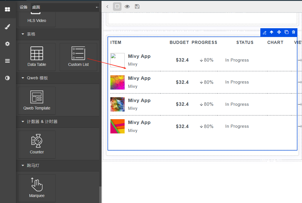
自定义列表
由于系统自带的列表颜色等不好控制,所以大多数时候我们还需要自定义列表,并且很多时候,列表是需要配合marquee(跑马灯进行滚动)。
自先拖动一个自定义列表到内容区域中。
以模型数据为例,当配置好字段,值域上下文和排序(同一般图表),接下来要修改模板。
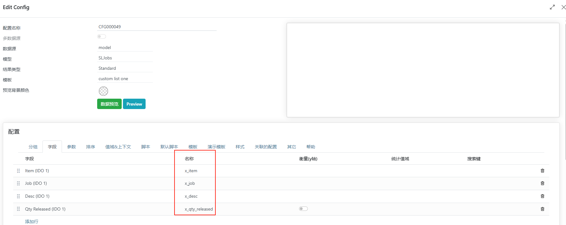
下面的代码就是一个简单的模板,标签中定义了表头。
定义数据来源<table class="table table-row-dashed align-middle gs-0 gy-3 my-0">
<!--begin::表头-->
<thead>
<tr class="fs-7 fw-bold text-white border-bottom-0">
<th class="p-0 pb-3 min-w-50px text-start pe-0">工单</th>
<th class="p-0 pb-3 min-w-100px text-start pe-0">物料</th>
<th class="p-0 pb-3 min-w-75px text-start pe-0">数量</th>
</tr>
</thead>
<!--end::Table head-->
<!--begin::Table body-->
<tbody class="text-white">
<t t-set="data_source" t-value="config.get_data_source(0)" />
<t t-set="records" t-value="data_source && data_source.datas || []" />
<tr t-foreach="records" t-as="record" t-key="record.id">
<!--begin::数据-->
<td class="text-start pe-0">
<t t-esc="record.x_job" />
</td>
<td class="text-start pe-0">
<t t-esc="record.x_item" />
</td>
<td class="text-start pe-0">
<t t-esc="record.x_qty_released" />
</td>
</tr>
</tbody>
<!--end::Table body-->
</table>
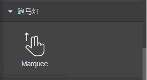
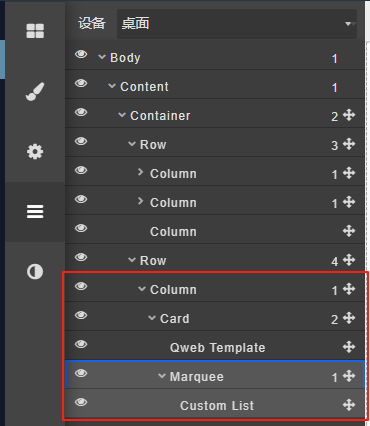
跑马灯
由于空间等原因,很多时候我们需要以滚动的形式呈现效果,就可以使用跑马灯。在Card里嵌入一个跑马灯,再把Custom List放入跑马灯。